It’s no secret that we’re big fans of hotels. Besides stating the obvious, we also wrote an article on can feel like a hotel guest all year round. For less of an ‘enthusiastic’ approach, we’ve narrowed down a list of six interior design ideas from some of our favourite best designed hotels worldwide, that fit right at home.
#1 Shades of Grey
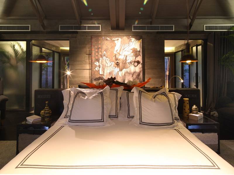
Where: Indigo Pearl, Phuket
The concept: The villa was designed by architect and designer Bill Bensley, whom envisioned traditional Thai wooden-beamed roofs and lush greenery, in an industrial setting. Open-plan space also plays a key role in the polished interior of the villa, but not without a slightly edgy finish. Think dark furnishings against earth-toned walls.
Get the look: Greyscale interior was a big trend in 2014, but it’s definitely here for the long-run. If black rooms are just too gloomy for your liking, tone it down a notch with tinted concrete floors, grey walls, blackened-steel furniture, and for full effect, dim yellow lighting.
#2 A Time-Traveller’s Nest
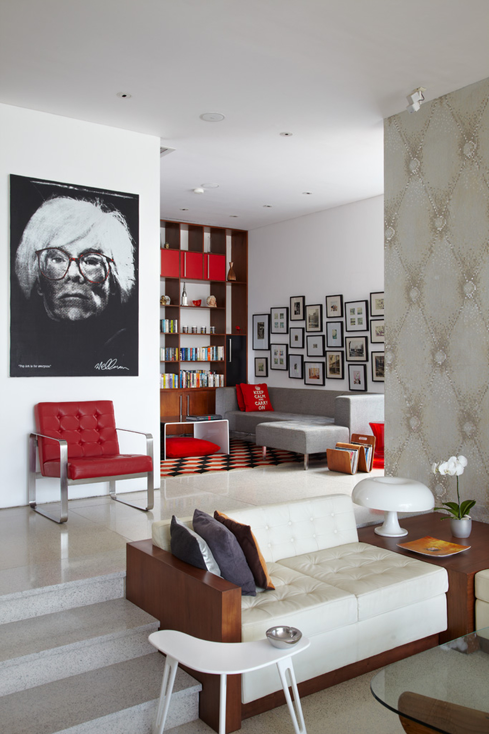
Where: Luna2 Private Hotel, Bali
The concept: Luna2 was named after the first spacecraft to land on the moon in the late 1950s (yeah, we had no idea either) so naturally, the villa has a retro, futuristic design. Owner Melanie Hall is to thank for the eclectic mix of 60s-inspired furnishings and 21st-century innovation.
Get the look: Shop at yard sales and vintage stores for some classic art pieces and other vintage trinkets. The ultimate gem would be a large photograph of Marilyn Monroe, just like the floor-to-ceiling piece hanging at the villa’s pool area.
#3 Rub-A-Dub Tub
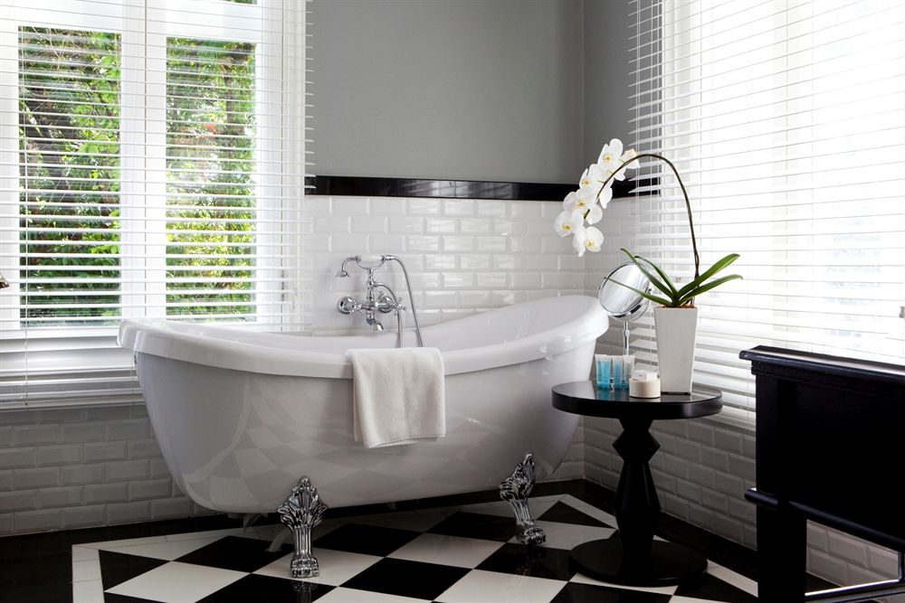
Where: The Majestic Hotel Kuala Lumpur, Malaysia
The concept: It’s one of the oldest hotels in the city, and was remodeled just a few years ago but still retains its old Malayan heritage feel, with dabbles of white marble. Complete with an Orchid Room which really, has more orchids than you can count, and Colonial style-dressed doormen, the hotel truly lives up to its glory days of the 1930s.
Get the look: Don’t you just love the sleekness of a classic claw-footed bath? In retrospect (pun intended), throwback decor is seriously making a comeback – note also the brick tiles and black and white tiling. How very old-school!
#4 Just a Splash of Colour
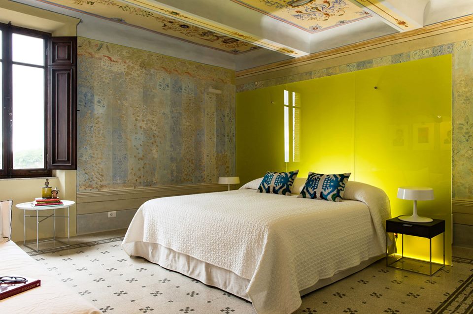
Where: Mazzini 31, Umbria
The concept: Cool story, really – the lodging was built in the 1800s, and during its recent renovation, the owners discovered layers of wallpaper, paint and plaster beneath its walls that uncovered beautiful imagery and ceiling frescos. So they did what any hotelier with a keen eye would do – retained its charm and turned it into a 21st century residence.
Get the look: When you can’t decide on a colour – and we’ve all been there – go with just one wall in a strong accent. This little trick will also make a room look much bigger.
#5 Bookmark This One
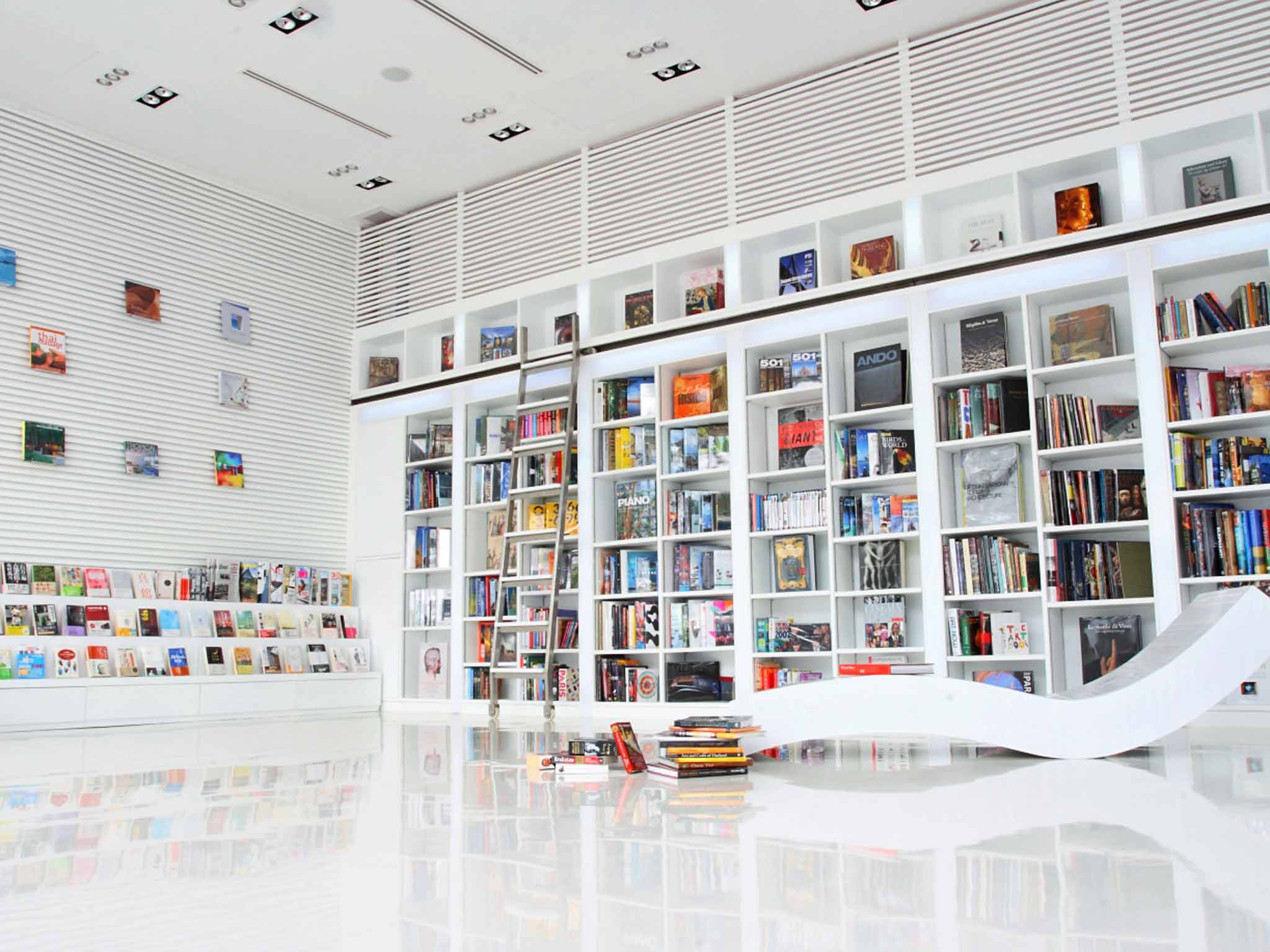
Where: The Library, Koh Samui
The concept: Designed by architect and interior designer Tirawan Songsawat, the resort has cool rooms and all that but as its name suggests, the library is the main attraction. It’s situated beachfront; a big white building with glass window panes and just outside, is a scarlet Italian-tiled swimming pool that gives the illusion of red waters.
Get the look: Got a room to spare? Turn it into a bookworm’s paradise with ceiling-high shelves and lounge chairs all in white. Yes, even the ladder.
#6 Dine Like an Elite
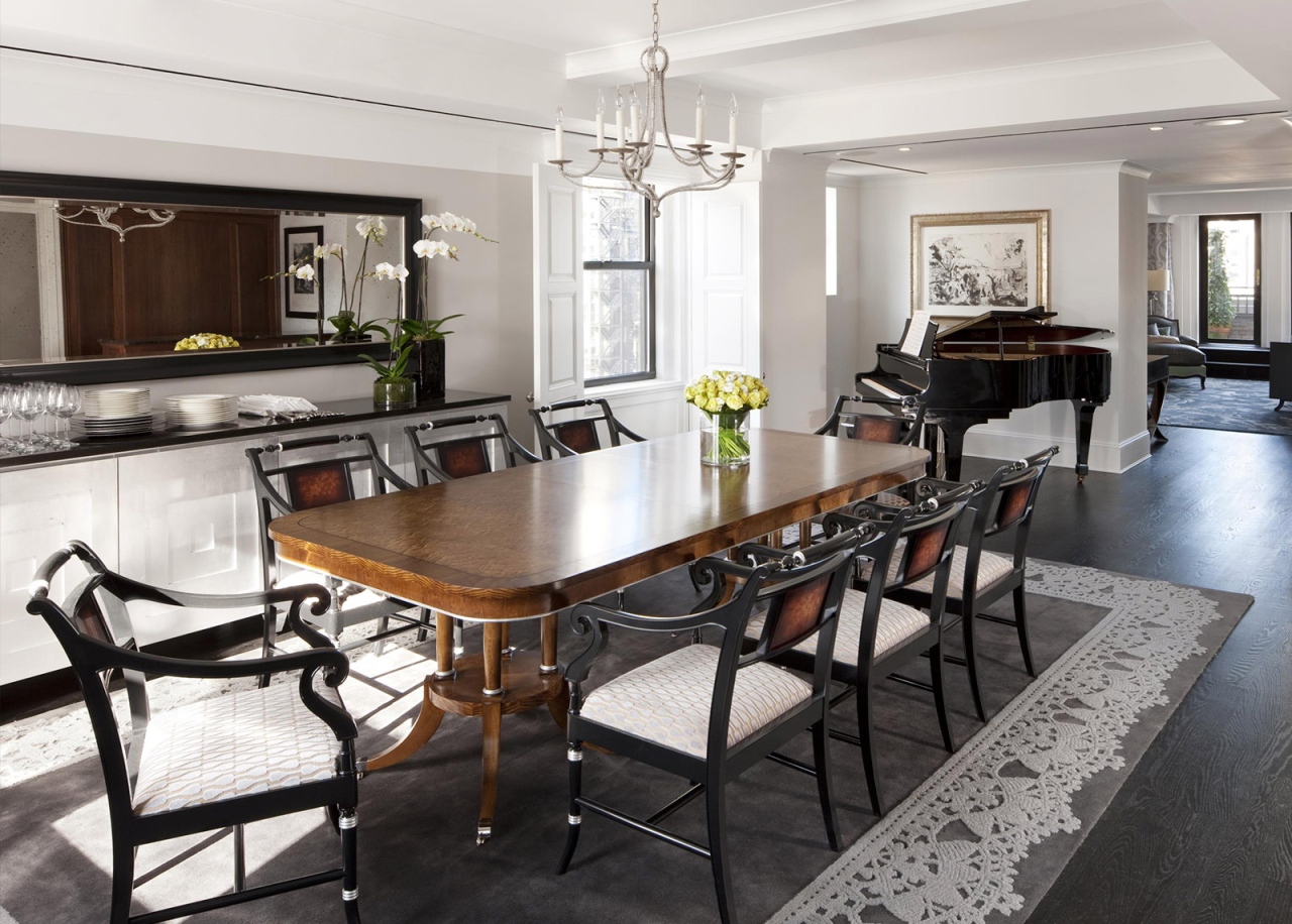
Where: The Surrey, New York
The concept: The near-90-year old building recently underwent a USD60 million renovation (wowza), and the end result is a true embodiment of Upper East Side living; luxurious, grand, and classy. Triple-sheeted beds, crisp white walls, beige marble and dark oakwood furniture, you’ve got to hand it to acclaimed interior designer Lauren Rottet.
Get the look: Less is more. We love how all the decor is simple in itself, but complements each other in a magnificent bigger picture. Add a few flowers here and there, and if you’re up for a splurge, throw in a grand piano.
Dreaming far and wide? Then it’s time to get inspired.
Photo credits: Main, 1, 2, 3, 4, 5 and 6.
