We’ll be honest, we don’t moisturise. Skin care and male grooming habits don’t often go hand in hand, but Aesop (we think) understands that and has found other ways to draw the male customer in — design. Founded in Melbourne in 1987, and now with more than 100 stores worldwide, this little Aussie startup is changing the skin care game. In teaming up with different world-renowned architects for every store and an incredible attention to detail in packaging and branding, Aesop is as much about design as it is their product, making visiting their shops a unique experience in every city. Here are our favourites around the globe:
#1 Flinders Lane
Where: Melbourne
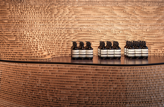
What: While Aesop’s flagship may be just up on Collins Street, mosey on down to this recycled gem tucked into one of Robert Hoddle’s originally planned laneways circa 1830. Designed in 2007 by March Studio’s Rodney Eggleston, it was originally meant as a temporary pop-up but proved so successful it stuck around. Constructed from over 3000 cardboard boxes normally used to ship Aesop products, the space was tweaked in 2015 by the Aesop in-house design department. The new iteration is more organic and curvaceous and we just want to run our fingertips all over it.
#2 Aesop Ion
Where: Singapore
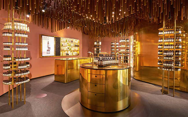
What: We love us some Snøhetta, and apparently so does Aesop – as they’ve now collaborated on the Berlin, Raffles City, and Oslo outposts. For Singapore’s Ion mall, the Norwegian architects drew inspiration from Orchard Road’s past as a nutmeg plantation, creating an ‘upside-down forest’ of dark wood hanging from the ceiling and Rose Quartz coloured walls referencing the colour of mace – the nutmeg fruit’s other harvested spice. Heavy on the brass, the tiny pocket-of-a-shop blows other big-name luxury retailers in the mall out of the water, proving small and insightful can pack a mean punch.
#3 Downtown LA
Where: Los Angeles
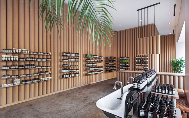
What: Located at 862 South Broadway, this garment district boutique designed by local LA firm Brooks + Scarpa uses cardboard tubing as the primary material for the interior, referencing the bolts of fabric that have historically been the lifeblood of the neighbourhood. The shabby-chic materiality continues throughout the space with countertops created from stacks of recycled papers, vintage porcelain sinks sourced from a nearby salvage yard and unearthed original concrete floors buffed and polished. Reminiscent of Shigeru Ban’s use of cardboard tubes, the downtown LA boutique is definitely on the chic end of the shabby-chic spectrum.
#4 Corso Magenta
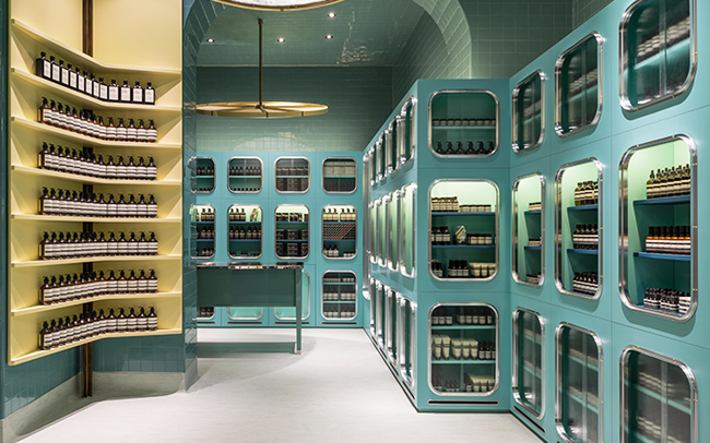
Where: Milan
What: Ahhhh Milan. Local designers DIMORESTUDIO went back to the butler’s pantries of 1930’s Italian villas for their inspiration for the Corso Magenta space. Only a stone’s throw from da Vinci’s ‘The Last Supper’ and literally across the street from Pasticceria Marchesi (which is a jaw-dropping design in and of itself) Aesop’s use of a vintage colour palette and glossy subway tiles heralds a trip back in time – and a good one. That butter yellow shelving? We wouldn’t be shocked if it makes a big splash next year. And, if you’re wanting to keep the pastel thing going, don’t miss a lunch at Bar Luce designed by none other than every indie kids’ favourite director Wes Anderson. Nomad Tip: There are 5 other Wes Anderson film locations fans can visit.
#5 Hollywood Road
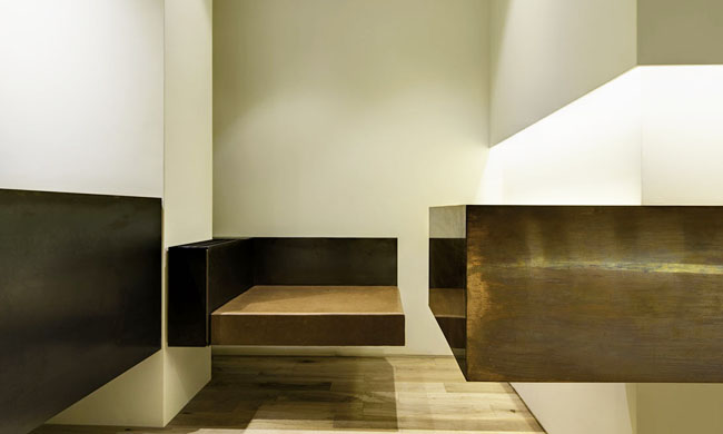
Where: Hong Kong
What: Taken on internally by Aesop’s Design Department, the Hollywood Road boutique exudes a boldness (if seen from the right angle) that proves they need not look elsewhere for some pretty slick interiors. While certainly not as exciting or forward thinking as their other shops, sometimes a solid and clean design is just what you need to escape the cacophony of Hong Kong’s over-stimulus; the Hollywood Road shop manages that, and, like a Rothko, remains a more timeless interior than a flash-in-the-pan design, outdated after a season.
#6 Le Marais
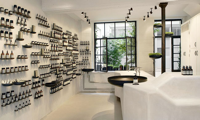
Where: Paris
What: French designers Ciguë crafted up this atmospheric boutique on a small, winding street which leads you through the third and fourth arrondissements. Understated and quintessentially Parisian, the all-white-and-black space focuses on the use of 427 oxidised steel pipe caps – the same as those used throughout the city’s drains – which become display shelving, planters, and the central sink. With an open garden courtyard to the rear of the boutique, a spring day here, with the windows open, should have you saying ohhh, la, la with ease. Nomad Tip: Double down and take it to the park: 5 Steps to the perfect picnic in Paris.
#7 Gastown
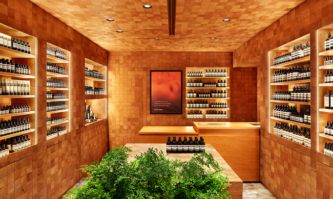
Where: Vancouver
What: Influenced by the historic Hastings sawmill, Aesop’s interior Design Department clad Vancouver’s Gastown location in a mosaic of Douglas Fir cut cubes and rough floor tiles referencing the paving of Water Street just outside. While perhaps nothing new to the lower-mainland interior design landscape, the cabin-like space is nothing but cozy for any visitor to the region and references what so many of those who grew up there (writer included) know as typifying the city. The smell of wet cedar…dreamy.
#8 Mitte
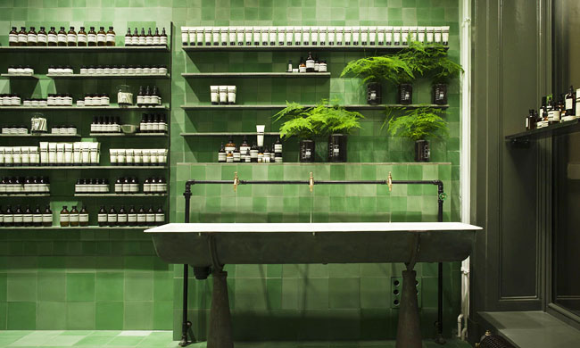
Where: Berlin
What: Probably our favourite on this list (if we had to pick just one), Weiss-Heiten was enlisted to design Aesop’s first presence in Germany. Located in Berlin’s dislocated centre – Mitte, and referencing the gritty streetscape and early Bauhaus influence on the city, we like to think of the shop as a well designed U-Bahn station for your face. Not to whitewash the current intercultural landscape of Berlin, the Mitte shop also features Lebanese design studio PSLAB for all lighting work, which means you should look up.
#9 Millenia Walk
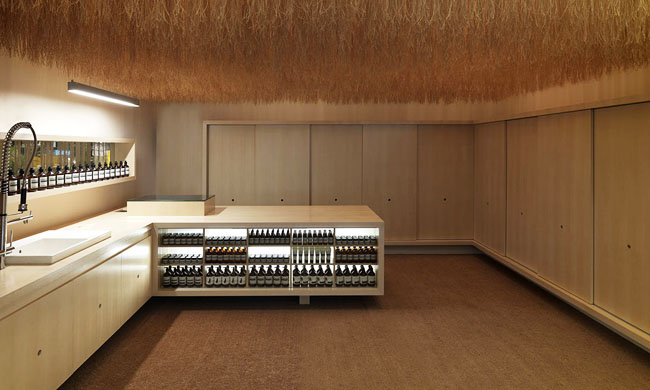
Where: Singapore
What: Back in Singapore, it’s worth your while to double-up on the Aesop stops and grab that parsley seed oil you were on the fence about while visiting the Ion location (your eyes will thank you). Another collaboration with March Studio, over 30 km of coconut husk fibre have been hung from the ceiling – a material common to manufacturing and craft in the region. Referencing the more wild and tropical side of the island-city, it’s a nice breather from the mundane urban order outside.
#10 Adelaide
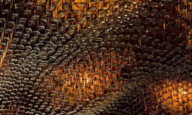
Where: Adelaide
What: One of the earliest collaborations with March Studio, Aesop Adelaide was definitely one of the most beautiful. Inspired by a trip to a farmers’ market, the entire ceiling was covered in Aesop’s signature brown bottles hung in an undulating sculptural wave. It took 7560 amber glass bottles to make the ceiling, and the entire installation was crafted in Melbourne and then shipped to Adelaide. Unfortunately, the store is now closed, so you can only see this one online. Boo.
Got a favourite that didn’t make the list? Let us and the other readers know in the comments section.
Well, that was refreshing.
All images via Taxonomy of Design, Aesop’s beautiful designer website.

